


Irvy Studio
A comprehensive brand identity and packaging design project for Irvy, a Washington, DC-based direct-to-consumer men's apparel brand. This case study explores the "Iron & Ivy" concept through bold typography, a striking Chartreuse and Charcoal Navy color palette, and a custom, USPS-compliant tapeless shipping box.

Introduction:
The Irvy Mindset
Irvy is a modern, direct-to-consumer men's apparel brand operating exclusively online from its home base in Washington, DC. Built for the modern urban man, the brand delivers versatile statement pieces that transition effortlessly from confident daytime streetwear to polished evening style. The core concept of the brand is rooted in the duality of "Iron & Ivy"—a careful balance between strength and structure paired with refinement and elegance. At Irvy, boldness is a mindset. The brand's messaging is anchored by strong statements like "BOLD THREADS. BOLD MOVES.", "LEAD. DON'T FOLLOW.", and "BORING IS BAD FOR BUSINESS".

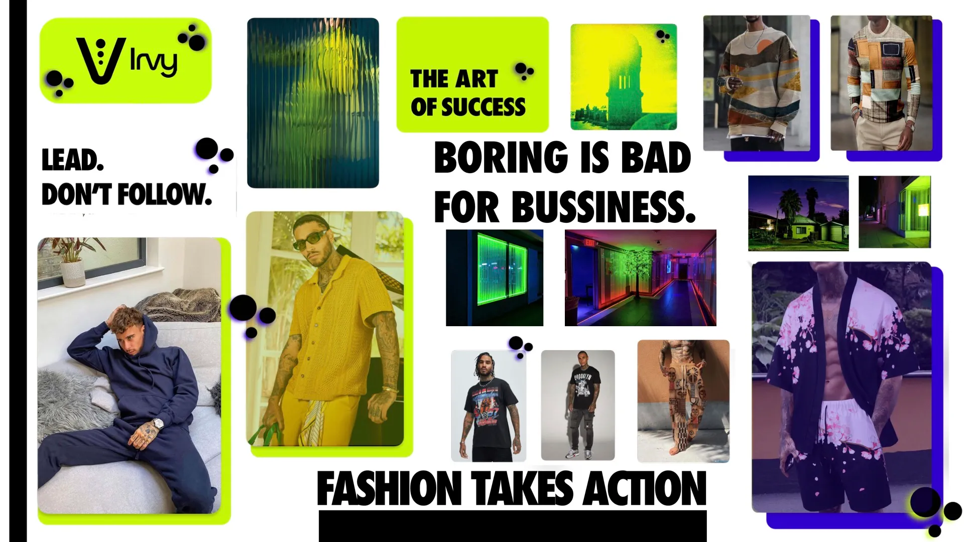
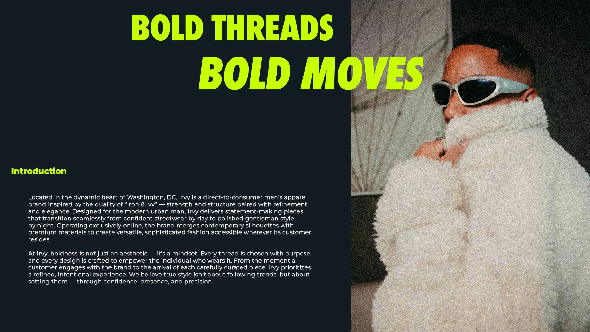
Brand Identity & Aesthetics
The visual identity of Irvy underwent multiple iterations to capture its confident, fashion-forward attitude. The final brand aesthetic leans into a high-contrast, energetic color palette and commanding typography.
Color Palette:
Chartreuse (#C5F501): The primary vibrant accent color.
Charcoal Navy (#131823): A deep, grounding neutral used heavily in the brand's packaging.
Vivid Cobalt (#3100CC): A striking secondary tone.
Bubblegum Pink (#FF5964) & White (#FFFFFF): Used for complementary accents and clarity.
Typography:
Primary Typeface: Futura (Condensed ExtraBold) drives the brand's bold, modern headlines.
Secondary Typeface: Swister (Regular) offers a stylized contrast.
Speech/Body Type: Montserrat (Medium) provides clean, highly readable supporting text.
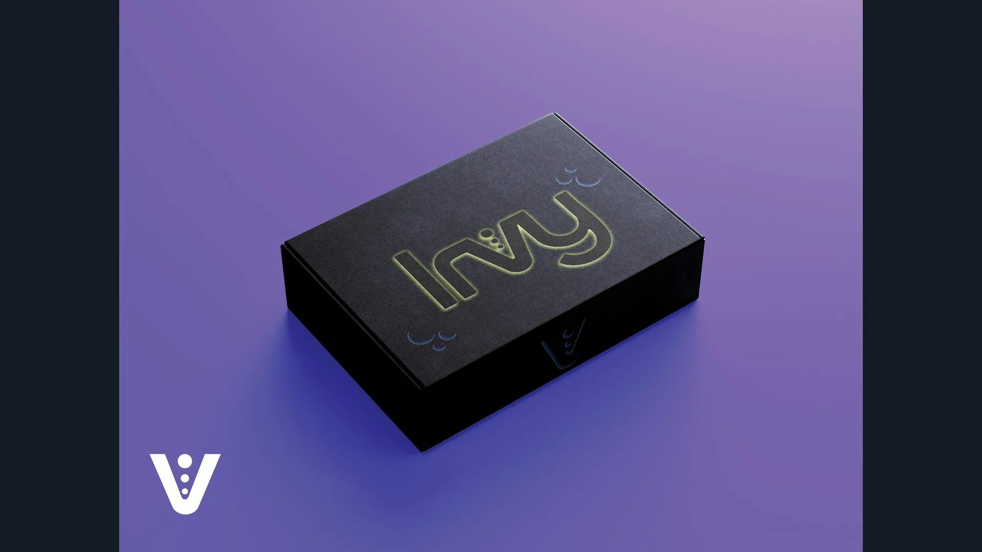
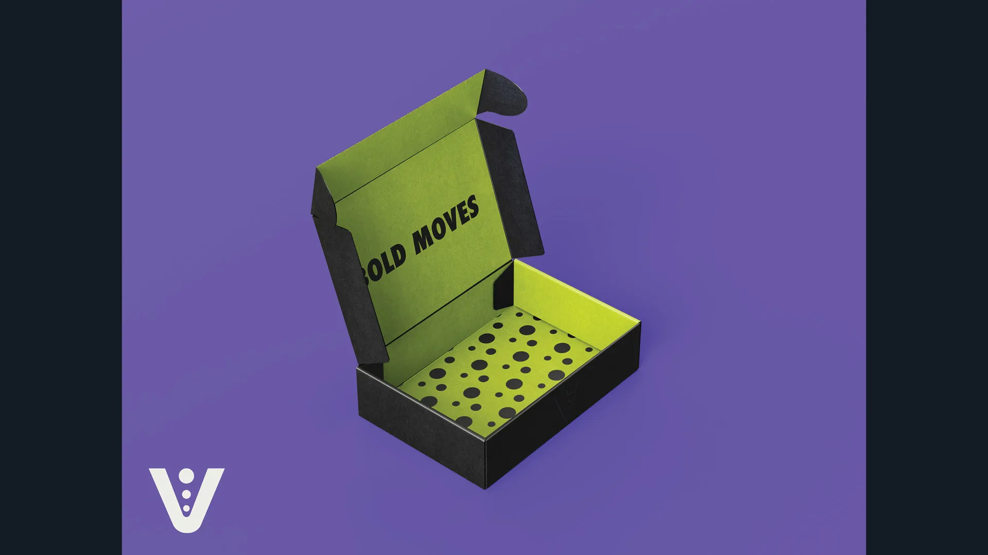
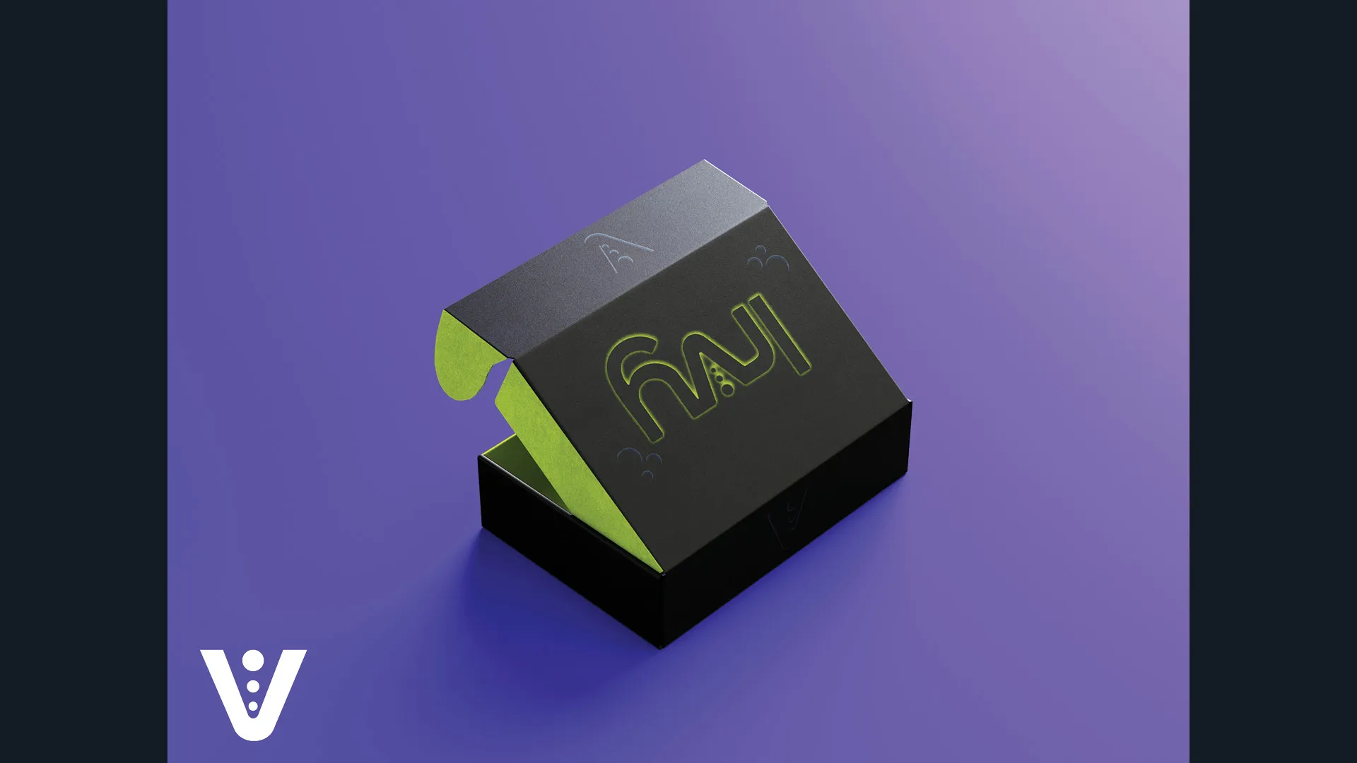
Structural Packaging DesignTo create a memorable unboxing experience that aligns with the brand's premium, direct-to-consumer model, a custom mailer box was engineered from the ground up. The box is designed around a tapeless, glueless assembly model. The structural dieline utilizes extended flaps and secure wings that lock over the base, eliminating the need for adhesive and creating a clean, sophisticated opening experience.
Key Packaging Features:
Exterior: The outside of the box utilizes the deep Charcoal Navy tone, featuring an embossed Irvy logo for a subtle, tactile finish.
Interior: The inside provides a bright, high-impact contrast, flooded with Chartreuse and featuring a custom polka dot pattern alongside the "BOLD MOVES" slogan.
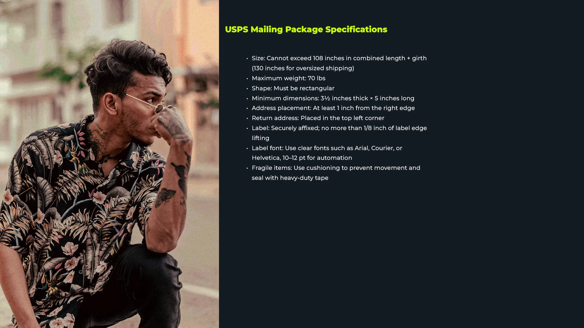
USPS Compliance: The dimensions and layout were strictly designed to meet USPS mailing specifications, keeping the combined length and girth well under the 108-inch maximum and ensuring the 3.5-inch thickness and 5-inch length minimums were met.
Labeling: Space was meticulously allocated for automated shipping labels, ensuring the delivery address is placed at least 1 inch from the right edge and the return address sits clearly in the top-left corner. This project bridges the gap between digital interaction and physical product delivery, ensuring that Irvy's bold narrative is communicated from the first website click to the moment the package is opened.
Build with: Photoshop, Adobe InDesign, Sketchup, Blender